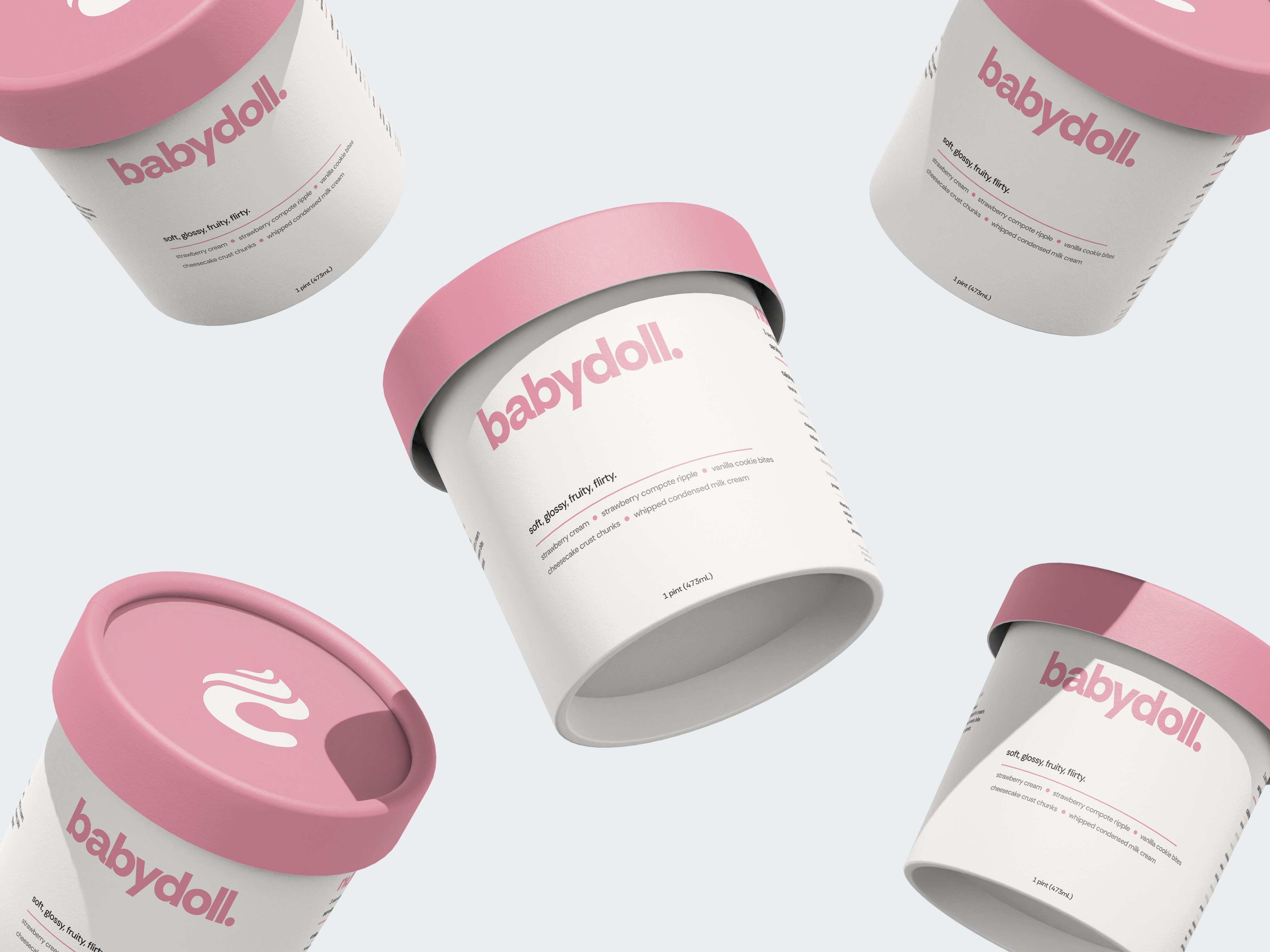
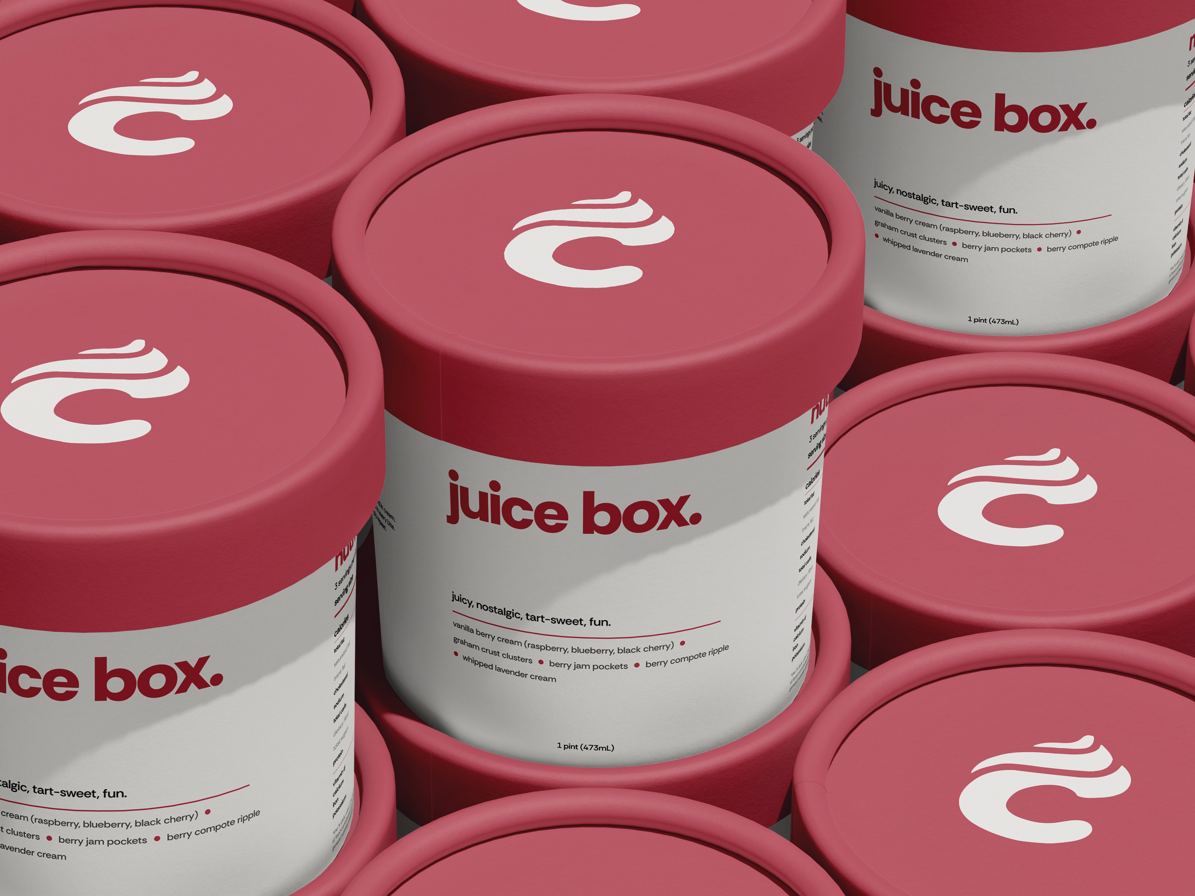
pint packaging.
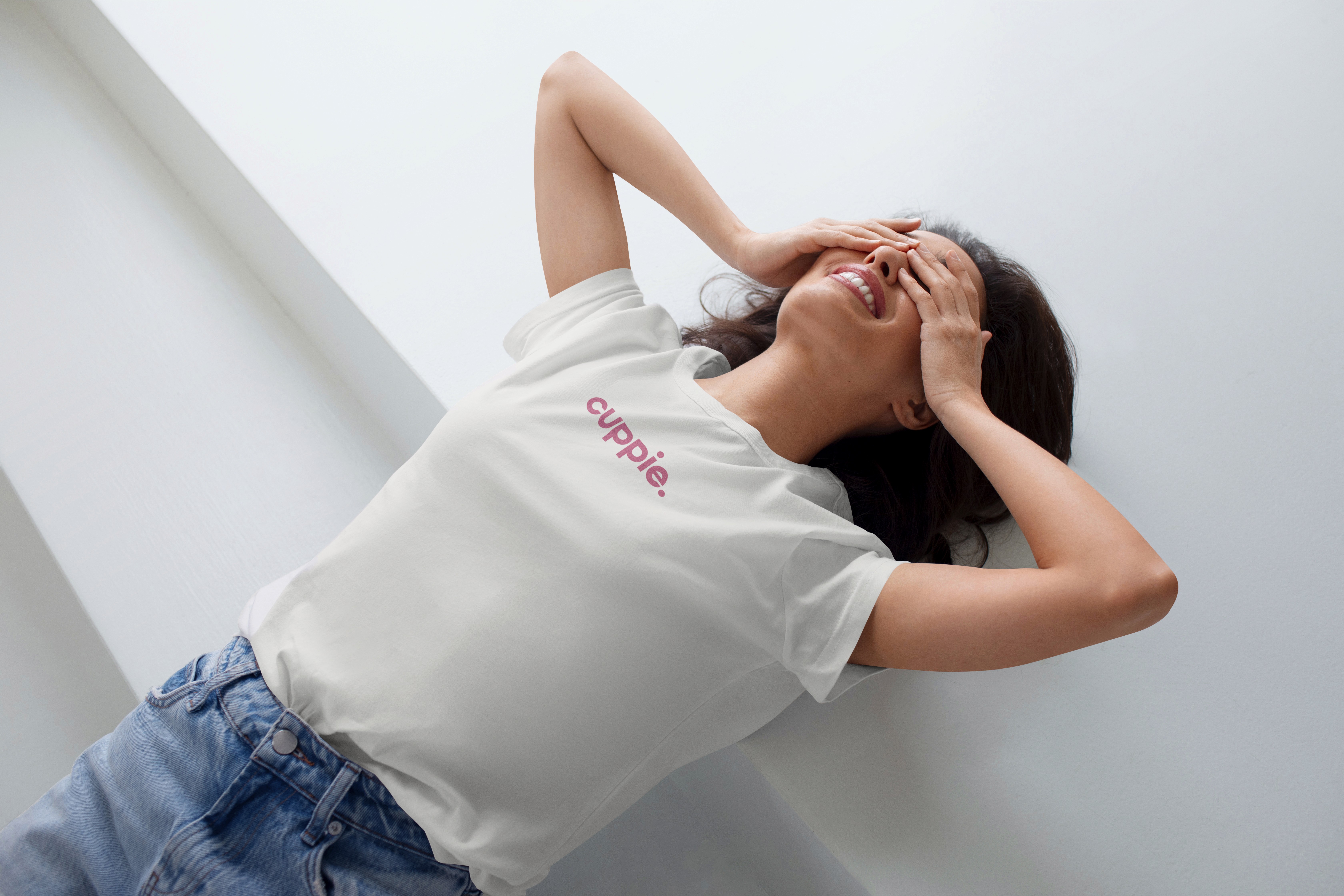
cuppie. it's exactly what it sounds like.
the form that shaped the feeling.
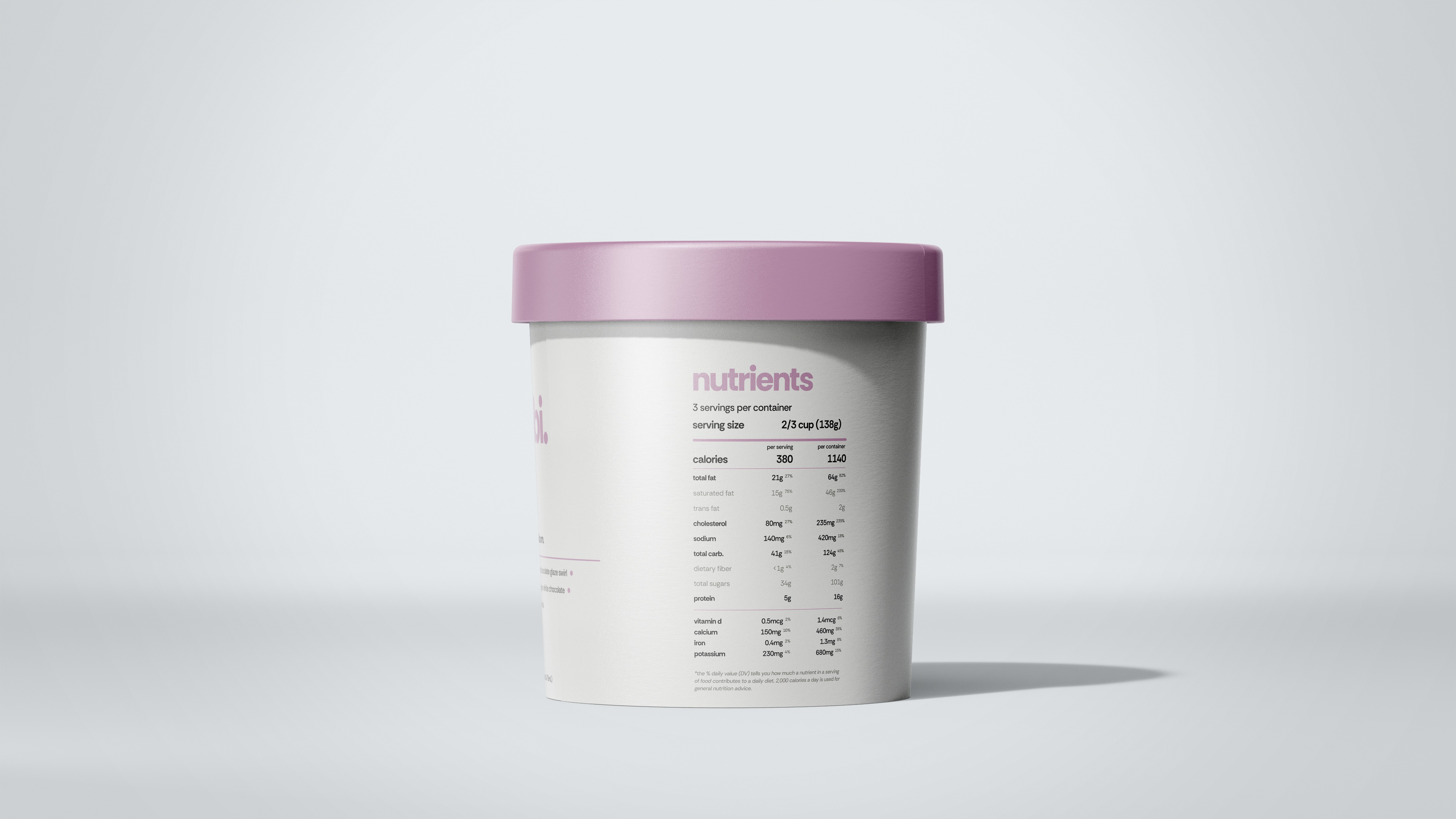
cuppie’s pint design doesn’t just contain pie — it redefines it. every inch of the packaging was carefully considered to merge food culture with beauty minimalism. the soft-touch finish, matte texture, and clean layout were inspired by skincare brands, not dessert aisles — because we believe dessert can be indulgent and intelligent. the lid system uses a rotating flavor-coded palette, making each cup feel collectible and aesthetic without being chaotic. the side panels keep things simple but sensory: key ingredients, dietary info, and dreamy descriptors. no clutter. no corporate energy. just a dessert that looks how it feels — intentional, editorial, and emotionally intuitive.

made for the moment (and the shelf).
while most pints are loud and cluttered, cuppie was built to breathe. our packaging is designed for both retail and DTC formats — whether it’s lining a freezer shelf at Erewhon or arriving in a curated subscription box, the format feels elevated and shelf-stable. it’s instantly photogenic, perfectly stackable, and made to be displayed just as much as devoured. with flexible barcode zones, adaptable lid colors, and flavor-specific visual identities, the packaging system was built for expansion and collaboration. (think: seasonal drops, brand collabs, flavor extensions — all seamlessly integrated.)
the pint that says everything.
every cuppie cup has a quiet thesis printed on the side: cuppie. it’s exactly what it sounds like. it’s more than branding — it’s a philosophy. the goal wasn’t to just make a new dessert, but to make something that feels obvious in hindsight. something that makes you go, “of course this exists.” that tiny line anchors every part of the brand experience. It invites curiosity, welcomes indulgence, and gently asserts that pie is now part of the culture again — not through nostalgia, but reinvention. because this isn’t just a container. it’s a new format for joy.